


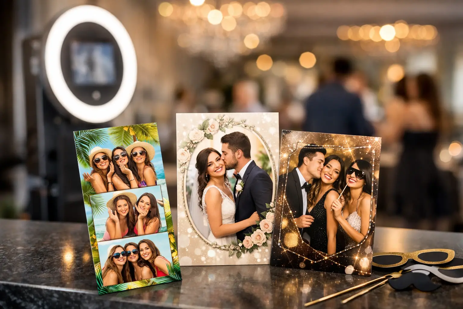
07 Aug Custom Photo Booth Overlays That Elevate Events
A guest steps into a photo booth, strikes a pose, and walks away with more than a flattering image. With custom photo booth overlays, every photo can carry the visual language of the event itself: a campaign’s signature color palette, a gala’s refined typography, a couple’s monogram, or a product launch’s bold creative direction. The effect is immediate. What could have been a standard photo becomes a branded keepsake designed to be shared, saved, and remembered.
For planners and brand teams, the overlay is not a decorative afterthought. It is one of the most visible details in the entire photo booth experience. It appears on every print, every digital gallery image, every texted photo, and often every social post that follows. Done well, it makes the activation feel intentional from the first guest interaction to the last post-event share.
Why Custom Photo Booth Overlays Matter
A photo booth naturally creates a high volume of guest-facing content in a short window of time. That is precisely why the visual frame around each image deserves the same attention as signage, invitations, stage graphics, and event collateral. An overlay gives that content consistency without making every image feel overly produced.
For a corporate event, the right overlay helps ensure that guest-generated content still feels connected to the brand. A conference might use a clean lower-third treatment with the event name and sponsor mark. A beauty launch may call for editorial type, a campaign color block, and a subtle product cue. At a wedding, the same concept becomes more personal: names, date, venue-inspired details, or a crest that complements the stationery suite.
The strongest designs do not compete with the people in the photograph. They create a polished setting for the moment. Guests should still be the focal point, while the branding works quietly and confidently around them.
The Best Custom Photo Booth Overlays Start With the Event Story
Before selecting fonts or placing a logo, clarify what the event needs to communicate. Is the photo booth meant to build brand awareness, celebrate a milestone, create social momentum, or give guests a premium favor to take home? The answer informs every design decision.
A marketing activation may need a direct campaign message or hashtag that is instantly recognizable in a crowded social feed. A formal gala may benefit from a more restrained treatment that reinforces the evening’s visual identity without overt promotion. For an employee appreciation event, the design can be warmer, more playful, and team-centered while remaining polished enough for professional sharing.
This is where a custom approach makes a meaningful difference. A generic template can display a name and date, but it cannot always reflect the visual hierarchy of a campaign or the atmosphere of a carefully designed celebration. Event graphics are rarely one-size-fits-all, and photo booth content should not be either.
Build From Existing Creative Assets
When an event already has a visual system, the overlay should extend it. Start with approved logo files, event fonts, colors, brand guidelines, invitation artwork, campaign imagery, or scenic renderings. These materials offer a clear direction and help the booth feel like part of the overall production rather than a separate vendor element.
For brand events, consistency matters most in the details: correct logo spacing, approved colors, legible type, and a layout that reflects the campaign’s tone. For private celebrations, a designer may pull from floral motifs, custom illustrations, venue architecture, or the typography used on invitations. The goal is cohesion, not duplication.
Design for the Photo, Not Just the Screen
An overlay can look striking on a laptop and still underperform once real guests begin using the booth. The difference is scale, movement, and human behavior. Guests may pose in groups, wear bold colors, hold props, or stand close to the edge of the frame. A design needs room for all of that.
Keep the center of the image visually open. Large logos, dense copy, or heavy graphic elements in the middle can cover faces and make a photo feel cluttered. Corners and lower borders often work well for event details, while a top border can carry a concise event name or campaign line.
Legibility is equally important. Fine script may look beautiful in an invitation suite, but it can disappear on a small mobile screen or printed keepsake. Contrast, font size, and placement should be tested with actual photographs, not just blank background mockups.
There is also a practical distinction between a digital-only experience and an event with prints. A design for a 4×6 print needs to account for trim areas and the physical proportions of the final piece. A vertical social format calls for a different composition, especially when guests are likely to view and share it from a phone. The best overlay strategy considers every output before the event begins.
Choose a Layout That Supports the Experience
Custom photo booth overlays can take many forms, but the event’s format should guide the layout. A classic open-air booth with printed 4×6 photos often benefits from a full-frame treatment that feels like a mini editorial cover. A branded GIF or boomerang may use a lighter corner mark so the motion remains the focus. A 360 video booth usually requires animated graphic elements designed specifically for movement and vertical viewing.
For an upscale wedding or gala, less can often do more. A soft border, monogram, and date can feel more timeless than a graphic-heavy frame. For a conference, a strong event lockup and sponsor recognition may be essential, but the layout should still leave guests with a photo they want to keep.
This is a useful place to consider trade-offs. More branding can improve campaign visibility, but too much can make a keepsake feel like an advertisement. A highly minimal design can be elegant, but it may not deliver enough recognition when the image travels beyond the event. The right balance depends on the audience, event goals, and how the content will be used after the doors close.
Details That Make an Overlay Feel High-End
Premium design is usually a matter of restraint and precision. It comes through in clear alignment, intentional spacing, crisp artwork, and visual elements that work together rather than compete. A logo should feel placed, not dropped in. A border should frame the image without crowding it. Colors should reproduce well under event lighting and across both digital and printed formats.
Consider adding a distinctive detail that gives guests a sense of occasion. That might be a metallic-inspired graphic treatment for a gala, an illustrated skyline for a destination event, a bold campaign pattern for a product launch, or a custom monogram for a wedding. These elements can elevate the visual result when they support the broader creative concept.
Just as important is what to leave out. Long URLs, multiple competing logos, tiny legal copy, and overly detailed artwork often create visual noise. If a sponsor message must be included, prioritize hierarchy. Guests should understand who hosted the experience without needing to decode the frame.
Professional Execution Protects the Final Result
The overlay is only as successful as its on-site presentation. A refined design paired with poorly lit photos, inconsistent cropping, or an unattended booth loses much of its impact. The booth, camera quality, lighting, backdrop, print stock, and attendant experience all influence how the finished content is perceived.
That is why experienced event production matters. At Pic Station, custom overlay design is considered alongside the complete guest journey: the booth’s physical footprint, the lighting environment, the sharing experience, and the event’s existing visual direction. The result is not simply a branded photo. It is a cohesive visual activation that feels considered at every touchpoint.
For teams working with agencies or internal brand departments, provide creative assets early and establish a clear approval process. Confirm the final output sizes, whether content is printed or digital, which logos are required, and who has final sign-off. This avoids last-minute changes that can compromise a carefully developed design.
Make Every Guest Photo Worth Keeping
The most effective overlay does two jobs at once. It gives the event a recognizable visual signature, and it gives guests something they are genuinely excited to share. When those priorities meet, the booth becomes more than entertainment. It becomes a content engine, a branded touchpoint, and a keepsake with a lasting place in the event story.
As you plan the visual details of your next celebration or activation, treat the photo frame with the same care as the invitation, stage, and décor. Every guest image is an opportunity to make the experience feel distinctive long after the event has ended.